When you look at an optical illusion, your eyes are doing their job, but your brain is making assumptions. Designers use this gap to create visuals that seem to move, bend, or hide depth where none exists. Research in vision science and Gestalt psychology shows that you naturally group shapes, follow contrast, and search for patterns, even when they mislead you. By understanding these techniques, you start noticing how simple lines or colors can reshape what you think you see.
You will also see how artists and scientists have explored these tricks for decades, from classroom demonstrations to museum installations. Once you know the principles, you can spot illusions everywhere.
1. Contrast manipulation
You notice edges because your visual system exaggerates differences in light and dark, a principle studied in classic illusions like the Hermann grid described by Ludimar Hermann. Designers place high contrast elements side by side so your brain sharpens boundaries, sometimes inventing shadows or flickering spots that are not actually present. This creates tension that makes flat graphics feel alive.
When you look closely, you may see phantom shapes or shifting tones. The effect comes from lateral inhibition in the retina, where neighboring cells influence each other. By carefully balancing brightness, you can be led to see depth or movement even on a still surface.
2. Forced perspective

You judge size and distance using familiar cues like horizon lines and relative scale. Forced perspective rearranges these cues so objects appear larger, smaller, or closer than they are. Architects and photographers use this technique to create playful scenes where proportions seem impossible yet convincing.
Your brain trusts perspective rules learned from everyday environments. When those rules are subtly altered, you accept the illusion without question. Classic demonstrations and stage designs show how simple positioning can reshape spatial understanding, making ordinary scenes feel surreal while still appearing believable.
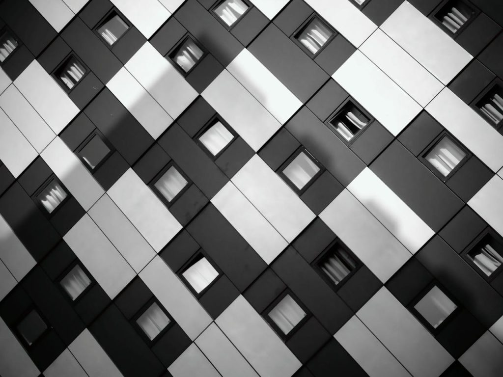
3. Repetition patterns
You naturally search for order, so repeating shapes draw your attention and encourage your brain to predict what comes next. Designers use tightly spaced patterns to create vibration or apparent motion, similar to effects explored in Op Art by artists like Bridget Riley. The repetition overloads your visual processing, producing a sense of movement.
As your eyes scan across the pattern, small inconsistencies trigger shifting impressions. You may feel as if lines ripple or pulse even though nothing changes. This happens because your perception tries to reconcile tiny variations while maintaining a coherent pattern.
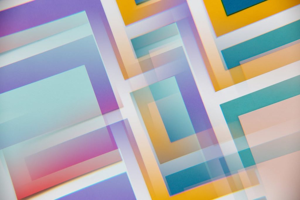
4. Color interaction

Colors influence each other depending on what surrounds them, a phenomenon documented in color theory and perception studies. Designers place hues in specific combinations, so you perceive brightness shifts or new tones that are not physically present. You might see a gray patch appear bluish or warm, depending on its background.
Your brain constantly adjusts for lighting conditions, and illusions exploit this adaptation. By controlling contrast and saturation, a static image can seem to glow or recede. The effect reminds you that color is not just a property of light but also a product of interpretation.
5. Ambiguous figures
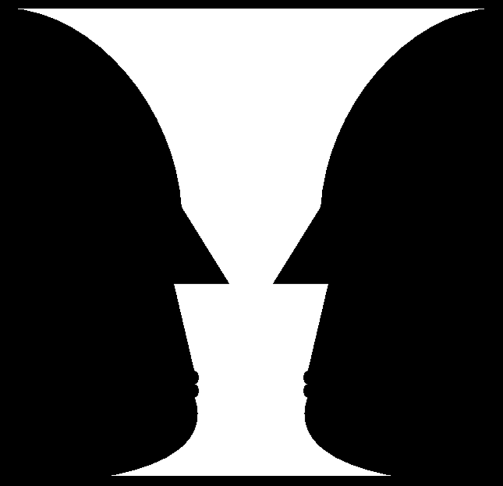
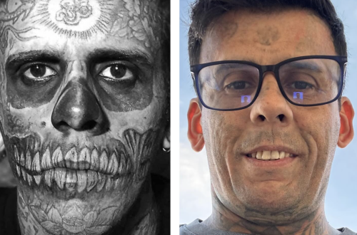
When an image supports more than one interpretation, your perception can flip between them. Classic examples like the vase and faces illusion show how figure and ground compete for attention, a concept central to Gestalt theory. Designers create shapes that allow multiple readings, so you experience a visual switch.
You may notice that once you see the alternate form, it becomes difficult to ignore. This happens because your brain seeks stable meaning and toggles between possibilities. Ambiguity keeps you engaged and highlights how perception depends on context rather than fixed reality. This is why ambiguous designs often feel strangely memorable long after you look away.
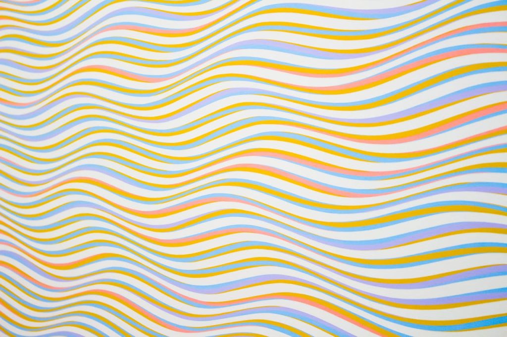
6. Implied motion
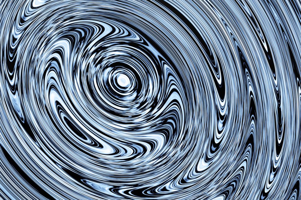
Static images can suggest movement by guiding your eye along curves or directional cues. Lines that converge or repeat in sequence encourage you to imagine flow, similar to techniques used in motion studies of visual perception. Designers arrange elements so your gaze travels continuously across the composition.
You may feel as if shapes swirl or drift, even though they remain still. The illusion works because your brain predicts motion from visual hints, filling in action where none exists. This creates energy and keeps your attention anchored to the design. You often notice this effect in posters or patterns that seem to pulse as you scan them.
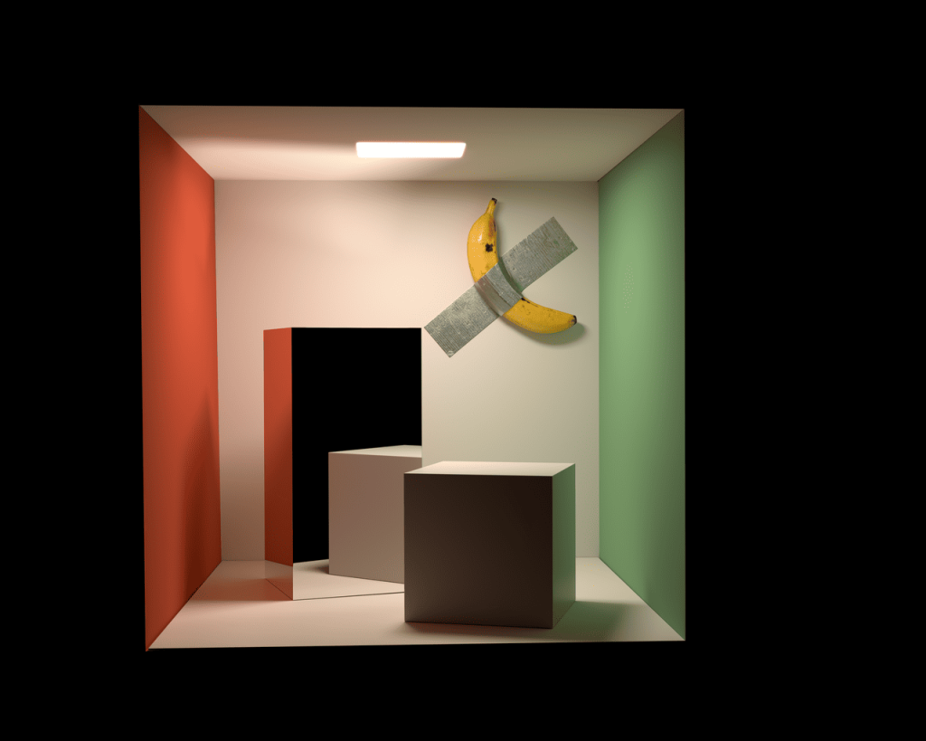
7. Depth cues
You rely on shadows, overlap, and size gradients to understand space. Designers manipulate these cues to create convincing three-dimensional scenes on flat surfaces. Experiments in visual psychology show that even minimal hints can trigger strong depth perception.
When objects overlap or cast subtle shading, you instinctively place them at different distances. By exaggerating or contradicting these signals, illusions can make surfaces appear to bulge or sink. You trust these cues automatically, which makes the effect feel natural. Even slight changes in shading can quickly alter how deep or flat a scene feels to you.
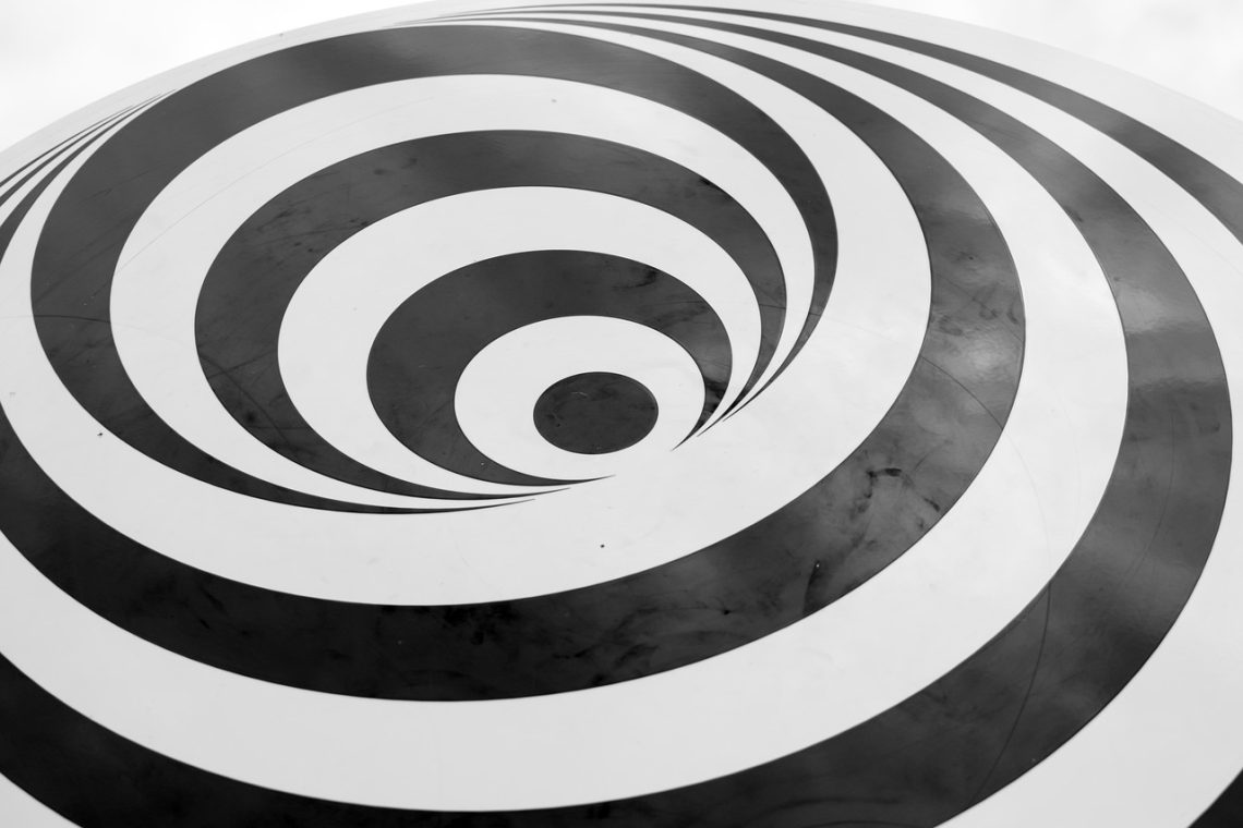
8. Distortion grids
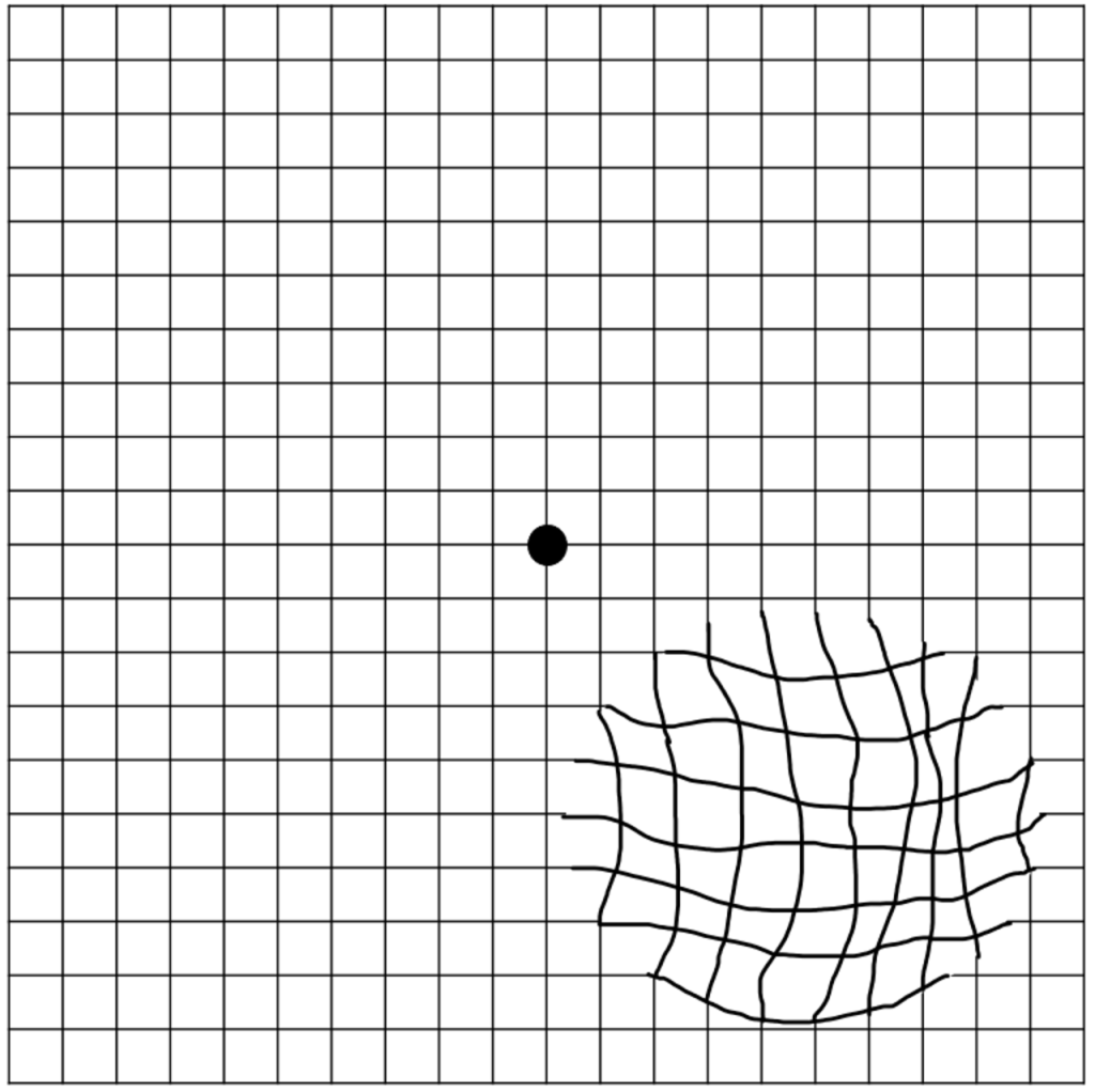
Warped grids trick your sense of alignment by bending straight lines into curves or tilts. Similar effects appear in well-known illusions where parallel lines seem to diverge because of surrounding angles. Designers use background patterns to bias your interpretation of geometry.
As you scan the grid, your brain tries to correct perceived distortion, creating a sensation of movement or instability. The illusion reveals how context shapes your judgment of orientation, reminding you that even simple lines can feel dynamic when framed cleverly. You may even find yourself double-checking whether the lines are actually straight.
9. Scale shifts
Changing relative size within a scene can confuse your expectations about proportion. Demonstrations like the Ames room, developed by Adelbert Ames Jr., show how manipulated geometry makes people appear to grow or shrink dramatically. Designers apply similar ideas in graphics to play with perception.
You compare objects automatically, so unexpected scale relationships feel surprising yet plausible. By altering reference points, a composition can suggest impossible spaces while still appearing coherent. This technique highlights how much you rely on context to judge size. Once you notice the trick, you start questioning how reliable your sense of proportion really is.
10. Hidden imagery
Designers sometimes embed secondary images within textures or negative space so you discover them gradually. Your brain initially focuses on dominant shapes, then suddenly recognizes a hidden figure once enough clues align. This delayed recognition creates a memorable moment of surprise.
You experience a small shift in perception as the concealed form becomes clear. The technique relies on your tendency to simplify scenes before noticing subtle details. It shows how attention and expectation shape what you perceive at first glance. Once revealed, the hidden image can feel impossible to unsee. This effect often rewards careful observation and invites you to look a little longer.
11. Light and shadow illusions
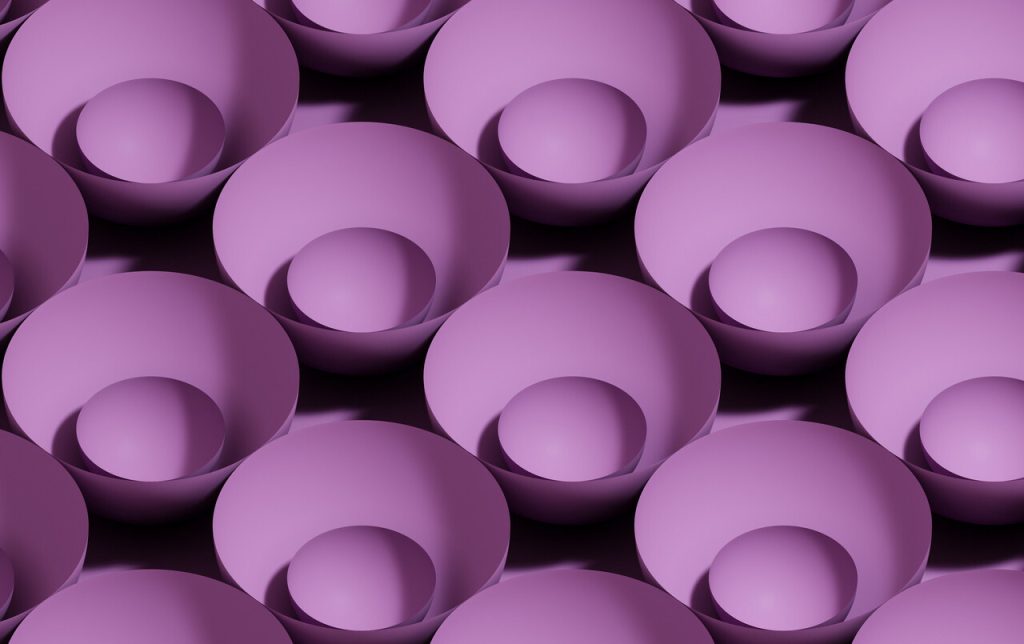
Carefully placed highlights and shadows can make flat forms appear sculpted or inverted. Vision research shows that you assume light comes from above, so reversing shading can flip your interpretation of bumps and dents. Designers exploit this bias to create dramatic transformations.
When shading contradicts your expectations, objects may seem to pop out or sink in unexpectedly. The effect demonstrates how strongly lighting assumptions guide perception. By adjusting tonal gradients, a simple drawing can feel surprisingly three-dimensional. You might even notice the form flip back and forth as your brain reinterprets the light source.